Friday, 10 December 2010

Font Ideas


Before creating the front cover for my magazine, I chose some fonts that I like and believe will look effective for the magazine title. I tried to get a range of fonts as this therefore enables me to choose the most effective font type.
The font names are called:
  • Jailbird Jenna
  • Hard Rock
  • Capture It
  • Body Hunter
  • A Bite
  • Base O2
I like the style of the 'Hard Rock' font (2nd one down), this is because I think it will look effective on the black and white image, the font will be red. The faded text looks unique as I have not seen other magazines with this type of font on the covers. I also like the boldness of the font, as it will stand out from the cover photo and therefore will attract the target audience.

I also like the font 'Jailbird Jenna', I may use this for other components in my magazine, as it is unique and still easy to read.

Wednesday, 8 December 2010

Double Page Layout


For the double page spread of my magazine I will compose an interview with the artist. So on one page I will have the interview and title of the interview. The other page will show one photo, of how the artist used to live, this will contrast with the cover as it shows they have gone from poor to rich because of their music.
Below is a layout of the double page spread, I think it will look effective as the large photo will break up the pages, and the text will be in one block and easy to follow.
I may change this layout slightly, with the image in the middle of the double page, and the text wrapped around the image, this can be done using Indesign. I believe this may look more attractive and professional as many magazines wrap the text around pictures.


Contents Page Layout


For the contents page, I want to use a simple layout, with a photo on one side taking half of that side up, and the text on the other as well as below the picture. I think this style is simple and wont over-crowd the page, as when I read magazine contents pages I want to find the page I want quickly. The contents page will show where specific interviews and other music news is found within the magazine.
Below is the layout I like, as it can still be attractive and simple to read through for the target audience.

Front Cover Layout

Before creating my magazine cover, I need to create a layout plan. A plan of the cover will benefit me as when it comes to making the cover time will be saved as I will know exactly where I want certain cover lines and other text, I want the layout to be simple, as the colours used will stand out well and too much text will over-crowd the page.
Below is a rough layout which I believe can work for my magazine, the finished piece may look different to the layout plan, but to start with this is the layout of my magazine.


Sunday, 5 December 2010

Contents Page Photos

I decided to use another model so I could place another photo on the contents page. I had to use a different model as having the same person in two photos on one page is not professional, and I have never seen magazines use the same artist twice on their contents page.

I had to take into consideration that my magazine is based on RnB and Rap music, therefore I had to choose a model I believed will fit the criteria, based on their overall image. Below are some photos I believe may work for the contents page.


Saturday, 4 December 2010

Double Page Spread Photos

The double page spread in my magazine will show how the artist has gone from being poor, to rich as they have become famous. Therefore I wanted a dark shot that reflects a dark past, which differs from the brighter cover and contents page photos. I kept the black and white photos as it matches the theme as the cover and contents.

Below are some photos that I believe can work for the double page spread.


gif animator
Gif animator

Front Cover Photos


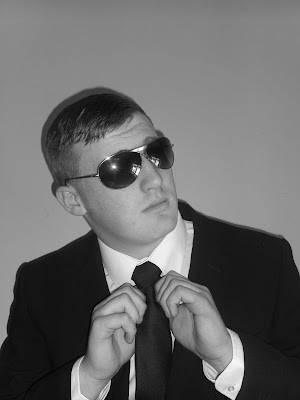
The magazine I am going to create is based on RnB and Rap music, I had to take this into consideration when taking photos for the cover as the model had to look like they were a RnB/Rap artist. I also had to have the picture in black and white as the colour scheme for my magazine is black, white and red.

Within these 5 photos, there is a front cover picture and also one that will be on the contents page.