Showing posts with label Double Page Spread. Show all posts

Tuesday, 8 February 2011

Final Work

animated gif maker
Animated gif maker

These are my front cover, contents and double page spread together. I believe the same colour theme and fonts used can clearly show that the house style has been achieved, as telling that all three are from the same magazine should be easy for the reader to perceive. Using the same model for all pages also makes the magazine easier to recognise as the reader can see that he will dominate the pages as he is on the cover.
When looking at each page I believe my magazine has been successful, mainly because you can tell the pages match and it looks attractive.

Monday, 7 February 2011

Finished Double Page


Above is my finished double page spread. I am pleased with the outcome of my double page spread as it can clearly be matched to my front cover and contents, which connotes a house style. The other factor of my double page is that I wanted to keep it simple and easy to read. I done this by using bold red and white colours so each question stands out, as well as using different fonts. ('Sliced Juice' and 'Candara')
The obvious factor of keeping the house style is that I used the same model for both the cover and double page, this is however a basic element that has to be used.

DPS Changing Font And Page Breaks

I am now coming to the end of my double page spread. When looking at it I decided to make the questions a larger font and to change the page breaks. This was because there was a gap at the end of the article, and to remove this I made the text larger to fill the page.

I then decided to change the page breaks, as I saw the other style shown below and thought it looked more attractive. After this I also changed the colour to white as the yellow did not fit the colour theme, and looked out of place.

DPS Near Completion

This is my current stage of the double page spread. I have almost finished apart from a few small things to complete or change.

From here I have added the other page number in the bottom right, which says 'The Mix P18'. I decided to add the second page number so that it looks more genuine and professional, as other magazines number every page. I followed the same process for this as the last page number I created. This was using the font 'Jailbird Jenna', and changing 'The Mix' to red and the 'P18' into white. I then added a drop shadow to the text to make it look more defined. To finish the process I saved the text as a PDF and 'Placed' it into Indesign.

Saturday, 5 February 2011

DPS Current Progress Four

Continuing with my double page spread I soon found a problem.

After I had placed another photo into the bottom left of the page I 'placed' my article into the double page to see the spacial area I had to work with. As the main photo is large and takes two columns not all of my text would fit on the pages, this caused me to delete the smaller picture found in the bottom left so that I could fit all of my interview on the page. At first I was rather hesitant to do so but once the text was in place I believed the double page looked more organised and had a nice flow to it.

Once I had arranged the text into suitable columns I then had the freedom to choose the font and colour. I wanted to continue the house style by using red, black and white colour text, due to having a black background I decided to use red for the question asked, and white for the response. To change the colour of the text you simply highlight the desired text, select 'swatches' and then the colour you want, which is done by creating a swatch first and saving it to the swatches tab.

Once the colours had been chosen and applied, I decided to find a suitable font for the text, I wanted to use a bold font for the questions, and a simple font for the answers. The bold font used for the questions is effective as it highlights which are questions and stands out from the black background, which will hopefully catch the readers eye. I chose to use 'Arial' for the answers, as it is very easy to read, and can be seen as a different person talking as it is in white and looks totally different to the bold, red text used for questions. For the Introduction and conclusion to the interview I used the font 'Santa Fe LET', I used this font for the second line of the title and believe it is original, and therefore an effective text to introduce the reader to the article and to conclude the article.

I also decided to add a 'Pull quote' to the article, this is the text saying "Now I earn out of what I was born to do", I decided to add this as it shows the reader a quick insight into what is in the article, as it is a larger and different font to the rest of the text. The font used for this is 'Jailbird Jenna', which I have used through-out the magazine for various parts of text. I wanted to use a different font for this pull quote as it has to stand out from the rest of the text to work in attracting the reader.


Friday, 4 February 2011

Adding The Page Number

Whilst looking through many music magazines, I thought adding the name and page number to the double page would be useful as it would follow the magazine convention, as every magazine has page numbers.

I created this by using Photoshop, as it easier to edit the text and 'place' it into Indesign as a JPEG, because then you can move it to the desired place easily. I chose to use the font 'Jailbird Jenna' once again as I used for the page numbers on the contents page, and to keep the consistent house style I opted to use it again. I chose to have the magazine name in red and the number in white so the reader can quickly see the page number from the other text. I decided to add the magazine name as I believe it is unique, and just adds that original touch to the page.


DPS Current Progress Five

The next step was to add a few small touches to the page, mainly to make it look more attractive and professional.

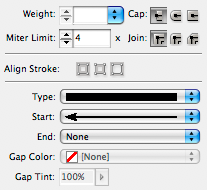
I began by inserting a page break to show where the article began and ended. This was done by selecting the 'line tool' and drawing it across a column. I then selected the 'yellow' swatch so that the line would be yellow and therefore clearly show that the article had began and then finished. I then selected the 'stroke' panel to add the small squares to each end of the line, the screen grab below shows the stroke panel, to add the small squares I changed the 'start' and 'end' drop downs to square.


Above is the finished page break, I placed one at the start of the article and one at the end.

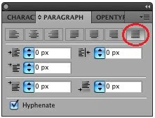
Once I had successfully inserted the page breaks I decided to 'Justify' my text, as when each line finishes at different places it looks un-professional and therefore does not follow the convention of most music magazine double page spreads. To justify my text I selected the 'Paragraph' tab, and chose the straight edge selection, which has been circled below.


Thursday, 3 February 2011

Adding Text To The Picture

When looking at my double page spread I realized that I hadn't actually mentioned my artist's name. I had to change this so I decided to put 'The Ed-Master' at the top of the photo I had placed into the page earlier.

I decided to use the same font as the title of the double page, this was so that it matches and looks more attractive to the reader. I inserted this text using Indesign instead of Photoshop. This is because I did not want any effects to the text, so using the text tool on Indesign was sufficient for this. I changed the fonts to 'Jailbird Jenna' and 'Santa Fe LET', as well as having the top in red and bottom in white, therefore it matches the style of the title.

Tuesday, 1 February 2011

Adding The Photo To Indesign

After editing the photo in photoshop I had to import it to the double page on Indesign.

I began by selecting 'place' and choosing the file I wanted to import as I did with the other photo. Once the photo was on Indesign I had to re-scale it so it fit into one column and around half the height of the column. I also cropped some of the photo as there was blank space which was not needed.

I added this photo so that the reader can see how the artist has been poor (photo on right) and how he is now rich and famous, as the photo just added shows more formal clothes which indicates his wealth.

Editing Another Photo

This the second photo I added to the double page spread.

The background of this image was originally white, and I wanted to change it to black so it would not be seen on the double page, as the background is also black.

I made the background black by selecting the 'Paint Bucket Tool' and then changing the 'colour picker' to black. Once these were selected I simply clicked on the background and it went from white to black.

I also edited the exposure slightly, so that the image would look brighter. I changed the exposure to +0.50 so that the image was clearer and will stand out on the double page more effectively.

Monday, 31 January 2011

DPS Current Progress Three

Once I had finished the text on Photoshop I had to import it to Indesign. To do this I selected 'File' and then 'Place...', once this is done I chose what file I wanted to insert into the double page.

Now the text is on the double page I had to add some effects to it so that it stood out on the black background, I chose the black background with the red and white text as it follows the colour scheme used on the cover and contents pages.

The only effect I wanted was to highlight the text so it was clear to read on the dark background, I chose to add a drop shadow to the text and make the shadow white, as if it was black it would not have shown on the background. Below is the 'Effects' selection screen, I chose the shadow to be white and the size of the shadow to be '2mm' and the opacity of the shadow 75%. I believe these effects give the text a more vibrant look and stand out easily from the rest of the page. The opacity at first was 100% and I believe it overcrowded the text, as it covered some of the letters which could not be read.


Above is the text with the effects added, I like the overall look of the title as it dominates the top left of the double page spread. I also like the difference of each font and colour as they stand out from each other, which shows how the artist has changed social class since becoming famous.

DPS Current Progress Two

The next step I took was to create a title for my article.

I began by opening Photoshop so that I could choose the font, size and colours. I used the font 'Jailbird Jenna' for the 'From Rags' part of the title, this is because this font represents the artists poor past, as the font is rugged and bold. I chose this text to be red as I want it to be separate from the 'To Riches...' part of the title, this will therefore show a change in the font and colour as to the actual artist from being poor to rich.

The second line of the title 'To Riches...' is a different font and colour as it clearly shows the change the artist has experienced, the font used is called 'Santa Fe LET', I like this font as it is totally different from the top line, and also it is original because I have rarely seen other music magazines with this type of font.

Each line of text has had a 'drop shadow', 'stroke' and 'bevel and emboss' applied to it, I chose to use these effects as they make the text more bold and will stand out well on a black background which so far is my desired background colour.

Friday, 28 January 2011

DPS Current Progress One

This is the photo I have edited on Photoshop, to import the edited photo from Photoshop to Indesign you click on file, and then 'place', this then allows you to choose a file from the computer and drop it into the double page.

Once the photo had been chosen and placed into Indesign, I had to choose what size I wanted it. I did not want the picture to cover one whole page as planned as I wanted an even balance of text and image. I decided to re-scale the photo so it could fit into two columns. The photo will still be rather dominant on the double page as it goes from the top of the page down to the bottom, and takes up a third of the space, but I believe it will still leave enough space for the article to be inserted onto the double page.

Creating The Double Page


To create my double page spread I am going to use the program 'Indesign', this program is suitable for the double page spread as it is used for publishing, therefore I can create the interview with my artist easily. The program also allows me to 'place' images from 'Photoshop' into my article, this means I can edit my photos and import them straight into Indesign.

Once I opened the program and selected new document, this pop up appears. To create my double page spread I selected 'A3' for the paper size, changed the page to 'landscape' and finally chose to use 6 columns. I chose these settings as one A3 page landscape is the same size as two A4 pages portrait, and therefore it shows as a double page of a magazine. I chose to use 6 columns as 3 columns per page should be enough space for the text, as I am planning to have a large photo which will take up 2 or 3 columns, therefore I need 3 or 4 columns for text and the title of the interview.

Thursday, 27 January 2011

Changing The Lighting

I continued editing the photo by changing the lighting.

I got to this screen by selecting 'filter', 'render' and then 'lighting effects'. Once on this screen I chose to have the light coming in from the top left, I like this as the lighting shows more of the background which is important, because the barbed wire and concrete bricks emphasise how he has changed social class since succeeding in music.

Choosing The Photo For DPS


When choosing my double page spread photo I wanted a medium shot showing how my model has changed from living a poor area, to having fame from their music. I chose to go out and take a photo at night, as the dark background can represent a dark past that the artist has experienced.
I believe this shot works for my article as the barbed wire, concrete wall and the night sky in the background gives off a more negative look, which is exactly what I was looking for.

I do not believe that my photo needs editing majorly, however I began by decreasing the brightness to -33, I done this so the artist's face is more recognisable, because when taking the photo the flash on the camera made his face unclear, so removing some of the brightness makes the image more clearer to see.

Friday, 21 January 2011

Double Page Ideas 2

I believe this double page spread is effective as there is a balance of text, picture and the title of the article.

I like the title used as the font is original, and really stands out from the page, the fact the title covers both pages shows how it is important, the bold use of black and white text may also connote the bold personality of the artist.

The photo shown takes up the whole right hand side page, this makes the spread more attractive as the photo is bold, and the red top she is wearing stands out from the black and white text.

The text used is shown in four columns, and only uses one page. This magazine has used a simple font as it has to be easy to read, because it is rather small. The large capital letter at the start also shows easily where the interview begins.

I like this double page as it uses a simple layout, and a similar colour scheme to what I want to use. I also believe the font used for the title is appropriate as it is unique and rugged, this connotes with the artist Lilly Allen as she is known for being original and bold.

Double Page Ideas

This double page spread shows mainly an image of the artist, which is 'Florence and the machine'.

I believe this layout is effective as the photo shows clearly who the article is about, the photo uses one page out of the two which enables a small amount of information. The way the artist is in-front of the title also shows how the image dominates the page.

The text used has been placed into three columns, this gives the whole page a more attractive look as the it looks more organised. I also like the large capital D at the start of the article, this looks more unique and shows the reader where the article begins clearly.

I do not believe that I will use the layout used on this page, as I want to have more text and centre the image, so the text wraps around the photo.