Monday, 20 December 2010

Finished Cover

This my finished front cover for my music magazine. I am pleased with the outcome of my cover as I believe it looks attractive and unique, I also used the colour theme and font I had chosen to use in the planning stages which shows the planning of the cover was effective and worth doing.
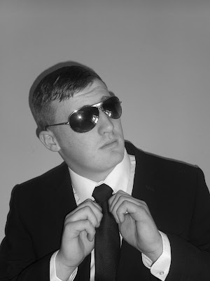
I also believe the overall style of the cover shows that the music genre is rap/RnB, as the cover lines show various artists from those genres, and the clothes the model is wearing, as many RnB and Rap magazines I have read often use the artist in a suit, therefore I had my model wear a suit to follow the style of other music magazines with similar genres. It also matches the colour I wanted to use as its black and white, with the red text.


Friday, 17 December 2010

Current Progress Three

Continuing with the front cover I have played with the circle shape, I have repeatedly changed the fill and opacity of it as the text didn't look as clear, and the circle didn't stand out from the background. I have applied the gradient overlay but made it more transparent. I believe this is unique as other magazines use solid colours for shapes used on the cover. I also moved the text layer above the circle layer, therefore the text layer goes over the circle which makes it look more bold.

I then changed the angle of the headline text "I am the ed-master", I made the text straight as it fills the bottom half of the page and can be clearly read. Making the text straight also allowed me to insert one more cover line about "V festival line up announced", I had to fill the area of the bottom left as it looked bare and I believe the information on a festival is relevant to a music magazine.

I also used the clone tool to remove the reflection in the sun glasses, as the reflection showed me taking the photo, so I cloned the black area of the glasses and replaced the reflection with black.

Wednesday, 15 December 2010

Current Progress Two

This is the next stage of my front cover, as you can see I have changed the font and the circle since the last post. I have also added more cover lines to the page.

I began by changing the font from 'Legend M54' to 'Indy Pimp', I done this because the old font didn't look clear from distance, therefore it did not look as attractive as it could be, The 'Indy Pimp' font is better as its easy to read and the overall look of the font is nicer than the 'Legend M54' font. I kept the black and red colours the same to follow the colour scheme. The bigger text: 'JAY-Z', 'DEVLIN', 'PLUS' and 'I AM THE ED-MASTER' is a font called 'Jailbird Jenna', I used this font whilst working on my preliminary task and believe it is original and attractive, so I used it again for the Unique Selling Points on the cover. For all of the text used I use a drop shadow and outer glow, this is done so the text looks crisper and is easier to read for the target audience.
The main story 'THE ED-MASTER' has been tilted across the photo, I done this so that it shows it is the name of the music artist on the cover, and it stands out clearly from the cover lines. The text 'Jailbird Jenna' has had a drop shadow, outer glow and a stroke added to it.

I then changed the circle I had created previously, I tilted the circle and text within it so that it looks more attractive to the reader. From my research I have seen magazine covers that tilt the writing of some main points inside the magazine so that they can be easily seen by the reader. I tilted the circle as the 'Top 10 Albums Of 2010' would be an interesting story for readers as they can see what came first. I also warped the text, using the 'Arc' option, I believe this makes the text fit the circle more, and therefore looks more attractive.

Warping Text


I decided to warp the text in the circle, as I believe it makes the text fill the circle more than having it central.

I selected the text tool whilst I had the layer selected, and then selected the warp tool. I chose to use the 'Inflate' style and bend it 45%. I believe this is effective as it makes the text and ellipse look 3D, and it looks more attractive and original, rather than flat text.

I believe this style is effective as the circle/ellipse has been more filled with the text, and therefore the whole image stands out as the text is bold and pops out of the page. I also needed to use black and red as the text colour, because I tried using just one and it didn't look as vibrant.

Tuesday, 14 December 2010

Current Progress


This is the progress I have made so far, since changing the brightness I have made some progress.

I have added a strap line to the bottom of the page, I done this so I could include more music artists and add more colour to the page, I believe this looks good as the red and black go with the overall theme. I added a drop shadow and outer glow to the text so that it is clear from the red background. The strap line was created by using the rectangle tool, and then adding the text (Indy Pimp font) over the shape as a new layer.

I then added the circle on the top right, with 'top 10 albums of 2010' inside it. This was done by using the ellipse tool. I had the circle behind the text so it is clear to see, as it is a unique selling point, as the reader can see what albums were the best of 2010. After inserting the circle I added the effect of 'gradient overlay', this makes the background match the background of the whole image, I then changed the transparency so the text would be more visible, I also added a stroke to the circle to make it look more distinguished from the background.

I then added the issue number and price under the title, I believe this is an ideal place for it as it is easy to see, and gives me more space for the cover lines. I followed the effects with a drop shadow and outer glow as I want the text to look the same through out. I used different colours for this as it breaks the text up, and therefore its easier to see what edition number the magazine is.

The Title Construction


This is the title of my magazine; The Mix.

Once I had fixed the brightness to the right level, I created the title, I already had chose the font which is 'Hard Rock', so all I had to do was re-size it and change the colour to red. I then added effects to the text, these were: drop shadow, inner shadow, bevel and emboss (gradient overlay) and finally a stroke. I believe these effects make the title stand out from the black and white image as the text is boldly outlined and a vibrant red. The faded effect of the font is also effective as I believe it works with the rap scene, as it is rugged and unique.

Starting The Cover


To start with my front cover I had to change the brightness of the image, the original photo was dark and to change this I selected 'image', then 'adjustments' and finally 'brightness/contrast'. I increased the brightness to 50, I believe this looks effective as the cover will now look crisper and will be easy on the eye to target audiences.

Friday, 10 December 2010

Font Ideas


Before creating the front cover for my magazine, I chose some fonts that I like and believe will look effective for the magazine title. I tried to get a range of fonts as this therefore enables me to choose the most effective font type.
The font names are called:
  • Jailbird Jenna
  • Hard Rock
  • Capture It
  • Body Hunter
  • A Bite
  • Base O2
I like the style of the 'Hard Rock' font (2nd one down), this is because I think it will look effective on the black and white image, the font will be red. The faded text looks unique as I have not seen other magazines with this type of font on the covers. I also like the boldness of the font, as it will stand out from the cover photo and therefore will attract the target audience.

I also like the font 'Jailbird Jenna', I may use this for other components in my magazine, as it is unique and still easy to read.

Wednesday, 8 December 2010

Double Page Layout


For the double page spread of my magazine I will compose an interview with the artist. So on one page I will have the interview and title of the interview. The other page will show one photo, of how the artist used to live, this will contrast with the cover as it shows they have gone from poor to rich because of their music.
Below is a layout of the double page spread, I think it will look effective as the large photo will break up the pages, and the text will be in one block and easy to follow.
I may change this layout slightly, with the image in the middle of the double page, and the text wrapped around the image, this can be done using Indesign. I believe this may look more attractive and professional as many magazines wrap the text around pictures.


Contents Page Layout


For the contents page, I want to use a simple layout, with a photo on one side taking half of that side up, and the text on the other as well as below the picture. I think this style is simple and wont over-crowd the page, as when I read magazine contents pages I want to find the page I want quickly. The contents page will show where specific interviews and other music news is found within the magazine.
Below is the layout I like, as it can still be attractive and simple to read through for the target audience.

Front Cover Layout

Before creating my magazine cover, I need to create a layout plan. A plan of the cover will benefit me as when it comes to making the cover time will be saved as I will know exactly where I want certain cover lines and other text, I want the layout to be simple, as the colours used will stand out well and too much text will over-crowd the page.
Below is a rough layout which I believe can work for my magazine, the finished piece may look different to the layout plan, but to start with this is the layout of my magazine.


Sunday, 5 December 2010

Contents Page Photos

I decided to use another model so I could place another photo on the contents page. I had to use a different model as having the same person in two photos on one page is not professional, and I have never seen magazines use the same artist twice on their contents page.

I had to take into consideration that my magazine is based on RnB and Rap music, therefore I had to choose a model I believed will fit the criteria, based on their overall image. Below are some photos I believe may work for the contents page.


Saturday, 4 December 2010

Double Page Spread Photos

The double page spread in my magazine will show how the artist has gone from being poor, to rich as they have become famous. Therefore I wanted a dark shot that reflects a dark past, which differs from the brighter cover and contents page photos. I kept the black and white photos as it matches the theme as the cover and contents.

Below are some photos that I believe can work for the double page spread.


gif animator
Gif animator

Front Cover Photos


The magazine I am going to create is based on RnB and Rap music, I had to take this into consideration when taking photos for the cover as the model had to look like they were a RnB/Rap artist. I also had to have the picture in black and white as the colour scheme for my magazine is black, white and red.

Within these 5 photos, there is a front cover picture and also one that will be on the contents page.


Friday, 26 November 2010

Target Audience Research

The magazine that I will produce will be based on RnB and rap. The word RnB stands for Rhythm and blues, the music uses instruments like drum kits, pianos, electric guitars and vocals. Rap music orignates from South Bronx, New York. It mainly consists of someone rhyming lyrics to a beat or instrumental beat. Music artists in RnB/Rap can be :
  • Professor Green
  • Jay Z
  • Devlin
  • Lil Wayne
  • Jay Sean
  • Iyaz
  • Eminem
These artists are mainly in the urban genre of music, I believe including artists like these will help attract the target audience as they are well known in the industry. I also believe that having this variety of music artists within the cover lines will connote with the title (The Mix), as there is a mixture of music, as Jay Sean is RnB and Devlin is rap/grime, therefore there is range of artists that will appeal to different people, thus giving me a larger target audience.

I visited the website UK Tribes to find out more on my urban target audience. I found the results showed some similarities with me, therefore I believe the genre I chose will be effective for the target audience. The target audience is mainly 14 - 24 year olds.

The results show that the urban audience enjoy music from channels like Kiss 100, MTV Base and AKA, these are music channels I often listen to and therefore my research has been a success. The result showing that they read magazines as light and medium shows that my target audience are not strong readers of magazines, therefore the magazine has to stand out and attract them to want to buy it.

Thursday, 25 November 2010

Planning - Title and Colour Scheme

I have chosen to name my music magazine The Mix, this came joint first in my questionnaire and I believe it is a suitable name as I will use a variety of music genres, therefore mixing the genres into one magazine. The word mix is sometimes also used for a slang word for song, I believe The Mix is an effective title as it can show a variety of music artists in the magazine, therefore attracting more people as there is more chance they will like some of the artists included.

The main colour scheme I will use is Black, White and Red. I researched a cover of XXL magazine which also used this theme, I believe it was a simple theme but still eye catching to the target audience, as the red stood out boldly from the black and white. Here are some covers I researched, with the colour theme I think will look best.


As you can see the red really stands out from the black and white, as it is vivid and bold. I also think a black and white photo looks more professional, and will be easier to adjust as a full colour image will contain more contrasts.

Wednesday, 24 November 2010

Magazine Title Ideas

I have chosen to create a rap/RnB/urban themed magazine, urban is where people enjoy a wide range of music genres such as rap, grime, drum and bass and RnB, this applies to me as i enjoy many types such as rap, drum and bass, pop etc. This also means I can attract a wider target audience to my magazine. I have done some research on magazines that are similar to what I want to do, I have visited some websites that I believe will give me ideas for my cover. Here are some covers that may help me with my planning.
Possible titles for the magazine:
  • Remix
  • Encore
  • Mash Up
  • The Lyrics
  • The Mix
  • Beats, Rhymes & Life
I conducted a small questionnaire within my friend group asking them to vote for their favourite name from the list above. Here are the results:

Clearly the results show that the top names were The Mix and Beats, Rhymes & Life with 5 votes each, I believe 'The Mix' is a better choice as it can symbolise a mixture of music, and the other title 'Beats, Rhymes & Life' is rather long for a title of a magazine.

magazine Analysis - Q (Inside)

This issue of Q magazine consists of 160 pages, with 32 being advertisements. The adverts in this magazine fall into groups, such as:
  • Alcoholic drinks
  • Male products (gel, aftershave etc)
  • Upcoming albums, festivals and tour dates.
The main articles in this magazine are:
  • Interview with Cheryl Cole.
  • Competition for Glastonbury tickets.
  • Going Under - article on John Lennon.
  • Interview with Them Crooked Vultures.
  • Canadian Adventure - Interview with The White Stripes on their tour of Canada.
  • My Record Collection - Holly Johnson goes through his vinyl.
The Q magazine achieves a unified house style by using the same colour theme on the cover, and in main parts of the magazine. They also use the same fonts through out, consisting of four fonts through out the whole magazine. The images below show that the same theme has been used within the magazine as well as the front cover. ( red, black, gray and white)

The house style used is appropriate for the target audience as it can show the genre of music, or the colours preferred by Cheryl Cole. The black and white image on the double page spread is effective as it shows a vintage rock style, it can also show a modern culture as many magazines are using retro graphics now to look original, this is effective as the use of colour and black and white show a retro yet modern layout to the magazine.

Magazine Analysis - Q (Cover)

The title of this magazine is Q, it is located on the top left of the page, with a red background and white sans serif font, the font may have been used to give the magazine a formal and mature look. The strap line used on this cover is "The UK's biggest music magazine", the font is in BLOCK CAPITALS, this is because it stands out and therefore will attract the audience to buy it to find out if they agree with the strap line. The main image is of Cheryl Cole, she has a persuasive facial expression, whilst gazing straight towards the reader, this may have been done to entice the target audience to buy it. The red lipstick she is wearing matches the theme of the front cover, as it contrasts with the black, gray and white. This image may also attract the target audience as Cheryl Cole is many girls role model, therefore it is effective as she is the main focus of the cover.
There are not many other images used on the cover, the only other image is the circle graphic, which includes information on John Lennon, they may have used the circle to separate that piece of text from the others, as it may be more important. I believe there are not many images used as the publishers want to keep the focus on Cheryl Cole, therefore she is the only image on the cover.
The cover lines show what else the magazine has to offer, they show that within the magazine the reader can find out about Snow Patrol, 50 Cent, U2 and Paul Weller. The cover lines are effective as they show the magazine has more than Cheryl Cole inside, meaning the reader can find out a large amount on a variety of artists.
The cover uses two fonts, this has been done to separate the text and to break it up. They have also used different colours for each part, this may have been done to make the cover look more attractive, it also shows a colour theme has been selected and used well. They have also used white and red backgrounds behind the text on the left to make it stand it out clearly, without changing the colour scheme.
The cover uses language techniques to entice the audience into reading it, or buying it. This has been done by emphasizing the main points with large text in BLOCK CAPITALS, for example "The 10 best new acts", they have done this so it stands out and makes the target audience want to find out who are the 10 best new acts. They also use three types of font and different colour for "three words... Cheryl Cole ROCKS", this shows that the text is the main focus as it stands out clearly from the rest of the cover.
The cover for this magazine is similar to others, as it uses a close up of someone famous and popular, many magazines do this to attract readers to their magazine. The unique selling point for Q here is Cheryl Cole, as she is very popular and a role model for many, therefore the target audience will buy it as they want to know more about her.

Magazine Analysis - Q (General)

Q magazine is produced by a company called Bauer, the company also produce MOJO magazine which is similar to Q. The target audience for Q are older teenagers to young adults (16 - 25), with music artists such as Kings of Leon, Lady GaGa, Cheryl Cole, Kasabian and Muse on the covers of previous copies the magazine can appeal to a varied groups of music genres, therefore having a large target market. The magazine is published monthly and costs £3.99. The circulation of Q magazine for June 2007 was 130, 179, however the last six months of 2009 showed a fall to 94,811, this may be due to more music magazines now available in shops or online. The NRS website did not show any information on Q magazine.

Annotated analysis of cover.

Tuesday, 23 November 2010

Magazine Analysis - XXL (Inside)

There are 142 pages within the XXL magazine. Out of these 142 pages there are 35 advertisements, this means 24% of the magazine is adverts. The adverts within this magazine could be put into groups such as clothing, cars, alcohol and music albums/gigs.

Clothing: Nike sportswear, Mauri Shoes, Rocawear, Pelle Pelle, Versace, Arctica Watches, New Look hair gel and Old Spice shower gel.

Cars: Nissan, Continental Tire, Mazda, Falken Tire, Forgiato, Pirelli, Black Ice alloys and Verde custom wheels.

Alcohol:Heineken, Paul Masson Brandy and Remy Martin.

Music: Trey Songz, Musicians Institute and Krizz Kaliko album.

They also have odd adverts such as warnings on tobacco and video games.

The main articles are as follows: interview with Ciara, interview with Keenon Jackson, favourite lyrics from top ten artists, article with various pictures by Kanye West, article on Kid Cudi and interview with rapper SHYNE.

There are 14 double page spreads within the magazine, these are:
  • Beats Rhymes & Life - showing Kanye West as the number one of ten of the best producers and rappers.
  • Six double pages for the article by Kanye West, containing photos and his story of becoming a rap artist.
  • Blade Runner - an article on Kid Cudi and a medium shot of him.
  • Two double pages on Nikki B, explaining her career in the music video industry.
  • Two double pages on rapper SHYNE, showing his story of his music career.
  • Two double pages on music DJ Funk-master Flex showing his involvement with Harley Davidson.
Within the XXL magazine there are a small number of advertorials, because they have a large advert taking a full page, next to an article. For example there is a page with an interview with Charlie Boy; an American rap artist, and the page opposite is a Rocawear advert, there is also a small advert for Heineken within the article on Charlie Boy which may portray an article and advert within the same page.

I believe the magazine achieves a unified House Style as all the pages on Kanye West are in black and white, this matches the theme of the front cover as the image of Kanye West is also in black and white. The text on the front cover about Kanye West's story is also followed within his article as quotes from the text have been enlarged and changed to be the same font as the front cover, it is also black text on a white background. The font used for the interviews is also the same, I believe it is either Arial or Comic Sans, this shows the house style as they have followed a trend with text size and font. The style has also been followed in the Kanye West part of the magazine as each image he has the same sun glasses on as his photo on the cover.
I believe this style is appropriate for the target audience because it shows articles along side with adverts that may appeal to young men, such as Versace and Rocawear advertising clothing. I also think that the black and white images make the articles flow better, as the colour scheme is the same throughout these parts of the magazine, this will appeal to the target audience as it makes the magazine easier to follow.

Magazine Analysis - XXL (Cover)

The title of the magazine is XXL, pronounced "double XL" was first created for rap and hip-hop music, the first copy was produced in 1997 and XXL was used so it stands out from the other music magazines available, as no-one had heard of a magazine named XXL is was original.
The title they use for the magazine is basic, with a red background and white writing, this is effective because it can stand out on many different images, and on this particular copy it does as only black and white are used which emphasize the red.
The strap line used on this copy of the magazine is "Special Collectors Issue", this shows how this copy is a one-off. The colour used the strap line is black, this was done so that it stands out from the white background, and follows the theme of the cover.
The main image used is the artist Kanye West, the magazine may have used Kanye West on the front cover as he is a very popular music artist, as he has covered rap, pop and R n B music, therefore he can attract a larger audience to read the magazine, which will increase sales. The facial expression used is very suave and shows the glamour of being a music artist like Kanye West. The pose that he is doing can promote the rap culture as he is holding a large piece of jewelry, and is covering his eyes with sun glasses. He is also almost looking straight down the camera, therefore engaging the audience into looking or buying the magazine. I believe the image of Kanye West is also effective because he is of similar age to readers, or may even be a role model for the target audience, I also think that most readers will be male and having a successful male artist will attract more buyers.
There are no other images used on the front cover, this may have been done so the main focus is on Kanye West. There isn't much need for more images as Kanye West is a huge artist, and will attract enough readers purely by the main image.
The only content promoted on the cover is "the exclusive story by the man himself", this adds to the main focus of Kanye West as the only cover line is promoting his section of the magazine.
The fonts used for the cover show a simple theme, as the cloned image is a complex part of the cover, the text doesn't distract the reader as there is little of it, the font used is all BLOCK CAPITALS and has no effects such as drop shadows, which are usually used on magazine covers. The colour chosen for the font is either black or white, this has been done as the theme of the cover is red, black and white.
The language used on the cover is very simple, and basic. Each part of text is very short, as it needs to show what is in the magazine but not to give too much away to the reader at first glance. The way they have used "exclusive" shows that they are the only magazine with this article on Kanye West, which will attract more readers to find out what he has said, the fact that the title is "LOVE HATE" may also attract people as it may show what he likes and dislikes, which is interesting to his fans as they want to learn as much as they can about him.
I do not believe this cover is similar to other magazines, as it shows just one image, and very little text, this differs to others as they usually have more than one image and more text to show what variety they have within the magazine.
The cover of this magazine is distinctive, mainly because the main image has been cloned and flipped so that the same image is reflected, the reflection also applies to the text used too, this is very different to other magazines as not many others have used this theme of little amounts of text, cloned image and flipped text. The cover has a unique selling point (USP) which I believe is the article they have on Kanye West, because he is a popular artist any information on him will be wanted by his fans, so the main image of him is the USP for XXL magazine on this issue.


Magazine Analysis - XXL (General)

The XXL magazine is published by a company called Harris Publications, the company also produce magazines sold in America such as Juicy and Mens Workout. I found this information on Wikipedia. The target audience for XXL magazine are people who enjoy rap music, there is no specific age limit but I presume it is teenagers to young adults. I paid £3.50 for the magazine which is published monthly. Within 2004 the magazine had 45,414 subscriptions in the first six months, with 266,789 single copies sold. I could not find any information from the National Readership Survey website about XXL magazine.

Here is an annotated analysis of the front cover of XXl magazine.


Thursday, 11 November 2010

Preliminary Task: Cover And Contents


Here are both my cover and contents pages, I believe they are similar enough for someone to see they match, and therefore the preliminary task was a success.

Preliminary Task: Contents Page


This is the contents page for the school magazine, I begun by choosing a background colour, I had to take into consideration using the same colours so that it would match the theme of my front cover. I also used the same fonts, and effects on the text here as I did on the front cover. I tried to use a similar layout too, I accomplished this by inserting the school logo in the same place as the front cover, as well as using the same student in the photo. I split the contents page into thirds, this was done so that more text could be used, and I believe it makes it look more professional. Once I had the images and text in the correct places, I adjusted the exposure, added a drop shadow and stroke to the pictures, I believe this is effective as it makes the pictures stand out from the page. The text used was also adjusted, by adding a drop shadow and stroke to it I think the text is easier to read and overall looks better for the page.

Monday, 8 November 2010

Preliminary task : Finished Front Cover

This is the finished front cover for my school magazine. After making the image lighter I decided to add the text. I used many different layers so that each bit of text can be separate colours, and have different effects. I then added the pictures of the school badge, and the film club poster. I had to change the exposure of the film club poster so it can be read easily. I finished by adding the bar code to the bottom left, so that the front cover looks more genuine.

Thursday, 4 November 2010

Preliminary task : Changing The Exposure


I had to change the brightness of the picture, so I clicked on "exposure" and changed the level so the whole image was lighter, as the original was rather dark. I believe this image is more affective for a front cover now as it looks brighter.

Preliminary task : Original Photo


This is the original picture I took for the front cover of my school magazine.

Thursday, 14 October 2010

Preliminary Task: Cover And Contents

Preliminary exercise: using DTP and an image manipulation program, produce the front page of a new school/college magazine, featuring a photograph of a student in medium close-up plus some appropriately laid-out text and a masthead. Additionally you must produce a mock-up of the layout of the contents page to demonstrate your grasp of DTP.